While I’m waiting on parts to arrive for the pop bumpers and a few different paint colours for the play field, I decided to do some work on the back glass lighting.
The colours on the Fireball Classic backglass are well known to fade over time. Mine isn’t the worst I’ve seen, but it would have looked so much better when it rolled off the production line.
One method I could use to bring back some colour is used covers over the bulbs. Using a combination of yellow and red covers, I could help breath some colour back into the backglass.
For things like High score, Match, Tilt, etc I left those with no covers.
I put yellow on the globes that highlight the 4 fireballs to try and give them some visible “heat”. I also used two yellows in the mix for lighting “Fireball!” also for effect.
I’m tempted to replace the middle red with yellow on the “Classic” text to try and give it more of a flame effect.
The rest i’ve used red to try and bring out a stronger red around the fireball guy.
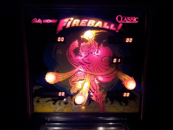
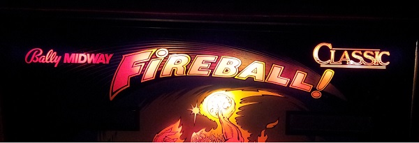
For a comparison, I did one said “Bally Midway” with red and left the other side “Classic” without to see the difference.. I much prefer the red with the covers on.
I’m pretty happy with how it comes up. It’s a shame there is no lighting on the yellow flames at the bottom. These really could do with some lights to help bring the colour out better.
Great restore! Love watching your progress!
I have a question about the back glass. When you slide it out to the side, do the top and bottom have protective trim strips attached to the glass or is it just the bare glass on the top and bottom and protective strips attached on the left and right?
Hi Ben,
Thanks for the feedback, glad you enjoy the write ups. I plan to finish the machine off over the Xmas break. I just need to install the new side art and t-moulding and then I’m done.
With regards to the backglass, on mine, I have black trim only on the left and right sides of the glass. If you check out my original post for this machine (here: Day 1) you can see the backglass removed and the trim on either side.
I can’t say if that’s how it’s supposed to be, but it seems like it would be smart to have trim on the top and bottom to better protect the artwork from damage – but that may mean it no longer fits the door correctly. I’m tempted to buy some and try it out though.